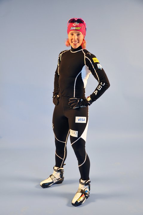
USST Goes Black for 2010-2011

Kikkan Randall modeling the U.S. Ski Team suit for the 2010-2011 season. Photo courtesy of the U.S. Ski and Snowboard Association.

In the sport of cross-country skiing, most people would agree that competing with New Zealand is probably smarter than picking a fight with Norway.

Consequently, the U.S. Ski Team (USST) will be wearing black suits for the upcoming season, eschewing the red spandex that has been the norm for the past few years.

After any number of years of being drowned out by a sea of Norwegian crimson, U.S. Ski and Snowboard Association Nordic Director John Farra said that the USST will be “distinctly not red” for the 2010-2011 season—including at World Championships in Oslo.

“We went in a very different direction, in part from our experience in Oslo, where they [Norway] have a nation’s group of ten, and we can barely see our athletes in the group,” he said.

Both the U.S. nordic combined and cross-country ski teams will wear the new suits all year—Farra said that there will not be a special outfit for World Championships.

The American uniforms are supplied by BJ Sport, the Oslo-based firm founded by Norwegian legend Bjoern Daehlie in 1996.

Farra met with the BJ Sports team on a recent trip to Oslo; before departing, he had said that he hoped to set up a long-term agreement with the company. While one did not materialize, Farra said that the USST was still “in good shape to hold onto them for the next few years.”

Billy Demong training in the new suit earlier this week. Photo courtesy of the U.S. Ski and Snowboard Association.

Comments

24 responses to “USST Goes Black for 2010-2011”

  1. RonBott Avatar
    RonBott

    Wow, these are horrible looking. I didn’t think it was possible to do much worse than the US Olympic suits, but congratulations, you just did.

  2. SickterScale Avatar
    SickterScale

    So sick. How can all black possibly look bad?

  3. nexer Avatar
    nexer

    I would have picked red/white/blue. How about some team replica hats or something else we can wear to show our support? Something unmistakebly XC.

  4. mnfinnkidd Avatar
    mnfinnkidd

    It looks more like a team salomon suit than a team USA suit. Bring back the suits from the ’94 olympics. They scream USA.

  5. doughboy Avatar
    doughboy

    Ummm. who cares?

  6. F. Scott Fitzgerald Avatar
    F. Scott Fitzgerald

    BJ Sport? Really? B. J. Sport???

  7. csanville Avatar
    csanville

    Its probably because they admire the Bowdoin Ski team so much.

  8. willwicherski Avatar
    willwicherski

    from the pictures, it definitely looks better in action, and probably with a bib

  9. Martin Hall Avatar
    Martin Hall

    What is the connection to anything American—black colored uniforms are passe by about 2 years—the only good thing you can say about them is that we don’t look like the Norskis anymore.
    Ooops—it will be easy to see on tv—no more guessing as to who is coming down the track—-I don’t think it is a popular choice—is it??

  10. T.Eastman Avatar
    T.Eastman

    A subtle political comment?

  11. crashtestxc Avatar
    crashtestxc

    Why would the USST give in and switch the uniform to black, namely because the Norwegians are sporting red? What’s the deal?!

    Black: Lacking all color, it comes off as conservative and basic. While it does denote power and strength, it is hard to compete in a venue with other color schemes because it just doesn’t stand-out.

    Red: Associated with fire, heat, and blood (everything necessary for ski racing), very intimidating, bold, fearsome. Just think of the pure power and visibility that red has…it is used on stopsigns and stoplights.

    It’s disappointing that the USST just stopped charging forward with their red suits of thunder! I hope that this switch is just temporary….2010-2011….!

  12. skipow Avatar
    skipow

    they look sick. like when spiderman went black. maybe usa’s gonna unleash the venom?

  13. davord Avatar
    davord

    I think it’s fine, as long as the whole team wears the same suits at the races. Does anyone remember Torino?

  14. sarcastic1 Avatar
    sarcastic1

    Apparently wearing black sheds 10 pounds, fitting since an obesity epidemic is sweeping across America.

  15. Mike Trecker Avatar
    Mike Trecker

    Anything but white.

  16. abarrett Avatar
    abarrett

    Black is badass!

  17. Harv-cat Avatar
    Harv-cat

    How un-American, wear is the black on the US flag? And BJ Sport and Audi? Lets get some Ford, Nike, and McDonalds logos in there.

  18. lsiebert Avatar
    lsiebert

    I agree that I would prefer to see the US team in something slightly more red/white/blue, I think its funny that people care this much about the suit design.

    harv-cat: They don’t just put random logos on the suits. Audi sponsors the team. If Ford, Nike, or McDonalds were providing the team with money and equipment, they would likely get logos on the suit.

  19. gankstaskiz Avatar
    gankstaskiz

    Racing suits are a status symbol. You think anyone covets their Kenya nordic suits as much as Norway? Sweden? Italy? This is the perfect time for USA to shed the old skin, because the old look wasn’t making the podium. No doudt, it’s athletic ability that determines speed and endurance, but the intimidation factor of a new, fresh, badass look at the starting line is huge in such a mentally and physically demanding sport.

    Norway is red, Sweden is white, and Finland is blue. I can bet I’m not the only one who got confused during the TV coverage of the most recent olympic sprints where every athlete in almost every heat was wearing one ot those three colors.

    We’re different now.

  20. lakeofsalt Avatar
    lakeofsalt

    the reason they dont get red/white/blue suits is because they want the general public to be able to get a hold of suits just like the olympic team…Although i agree the USST needs to make money i also agree we NEED some national pride in this sport if we plan on being supported, so please put R/W/B on the next suits

  21. Put the Luke to the jager Avatar

    I agree with willwicherski They probably do look better while someone is skiing in them. I will admit that black is not the most ambitious color, but I think as long as USA is wearing them they will look great! 🙂

  22. Train Wreck Avatar

    I thought that the last red ones with orange were actually really cool. Consistency is a really big deal though. Superficial, but a big deal.

  23. Tim Kelley Avatar
    Tim Kelley

    I think the new suits look great. I’ve always liked the German suits that usually have a lot of black on them. Perhaps in the future some of the flat seams that connect the panels could be sewn with blue and red thread – and that would make the USA connection in a subtle way.

  24. shreddir Avatar
    shreddir

    Yeah, but the German suits incorporate the classic Adidas 3 stripes down the side along with the easy to read “Wurth” logo patch. It just looks like it belongs on an athlete not a circus billboard. For years I’ve been wondering how I can score one of these for myself.

Leave a Reply